Brand guidelines · v1
Velvet-rope confidence.
Calm, premium, precise — the sommelier, not the barker. This page is the working reference for how Velvet looks and speaks.
Wordmark
A “V” cut from two overlapping folds of fabric, beside the lowercase wordmark in Fraunces. Never letterspaced, never uppercased, clearspace of one “v” on all sides.
velvet
Color
Ink and plum set the room; velvet and rose are the light in it. Champagne is jewelry — if it's doing more than accenting, it's doing too much.
Ink
#0A0710
Background. The room with the lights down.
Plum
#171021
Raised surfaces and cards.
Velvet
#D4326E
Primary accent. The rope.
Rose
#F27CA4
Gradient partner, hover states.
Wine
#59173A
Deep fills and chart areas.
Champagne
#DDBE92
The jewelry — eyebrows, rules, 18+ chip.
Cream
#F2EDE6
Headline text, warmer than white.
Mist
#A79DB3
Body and secondary text.
Signature gradient · Velvet → Rose · 120°
Typography
Display · Fraunces 500–600
Behind the velvet rope, measured.
Text · Geist Sans
Body copy is warm, unhurried and specific. Numbers are the product; every claim carries one.
Data · Geist Mono
412,000 subs · 6.4% ER · $7k flat
Art direction
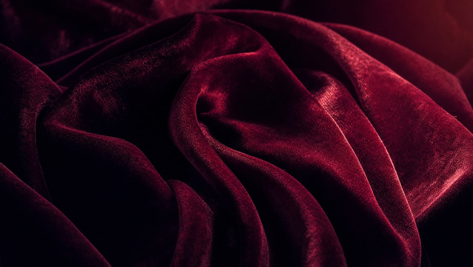
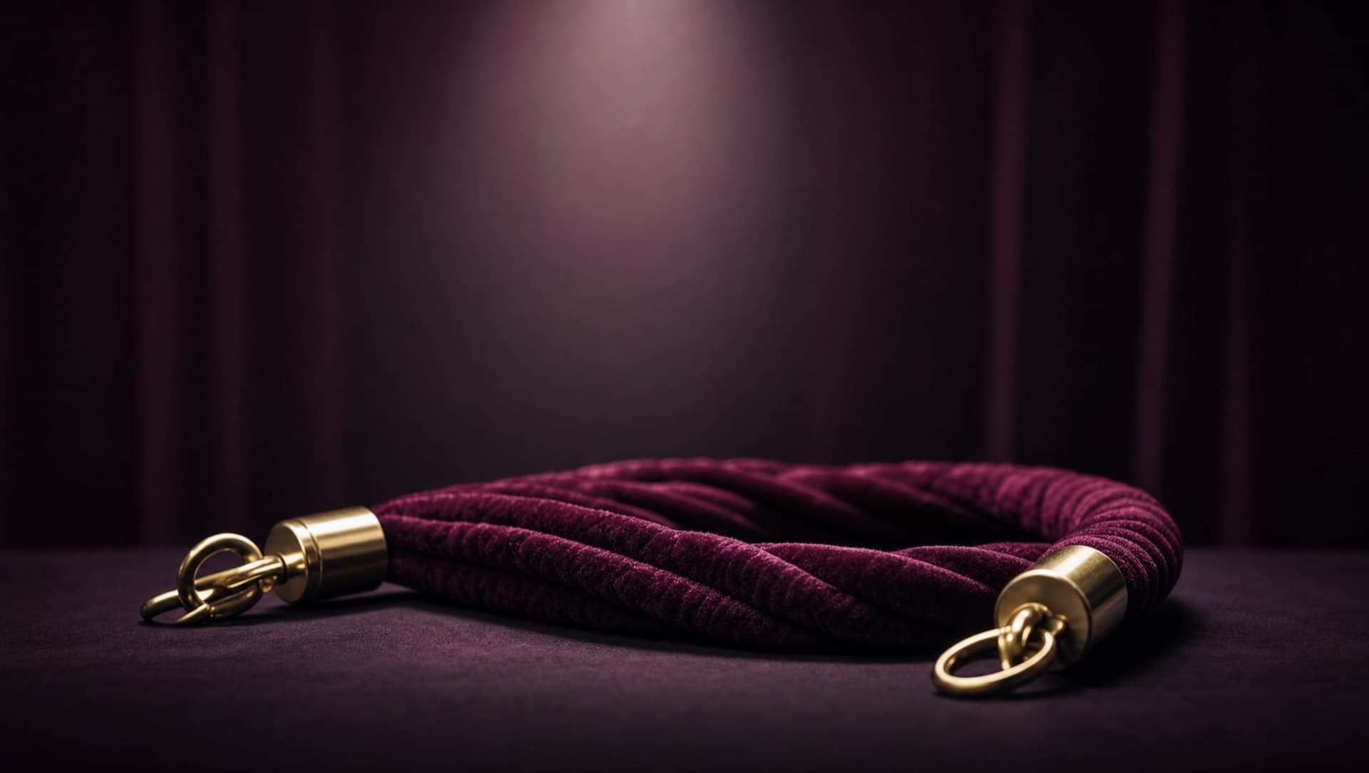
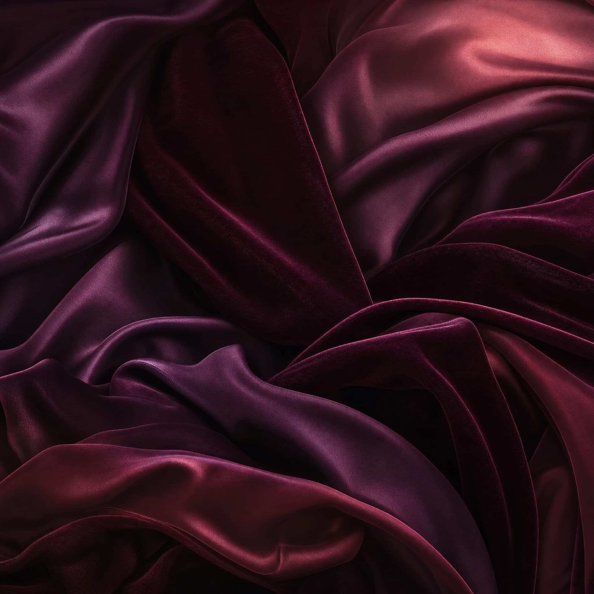
Cinematic, abstract, SFW. Drapery, not skin — macro fabric, the rope itself, rim-lit folds in wine and ink. No people in brand imagery; people appear only as product UI.
Voice
We say
- “Adult creator economy” — plainly, no euphemism
- “Verified, creator-authorized, first-party”
- “Everyone else said no. We built the yes.”
- One wry line per page, maximum
We never say
- “Naughty,” “spicy,” NSFW-as-a-joke
- Winking emoji or coy censorship (f*llowers)
- Anything that apologizes for the market
- Anything a barker would shout